How to Add Axis Labels Microsoft Excel
- George Apostolov
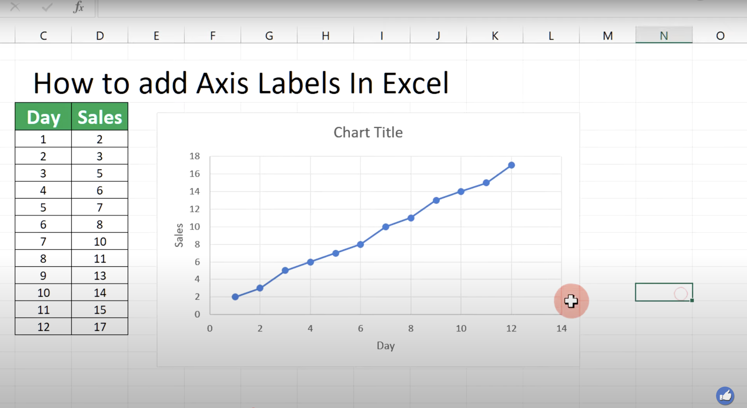
How to Add Axis Labels Microsoft Excel: step-by-step guide
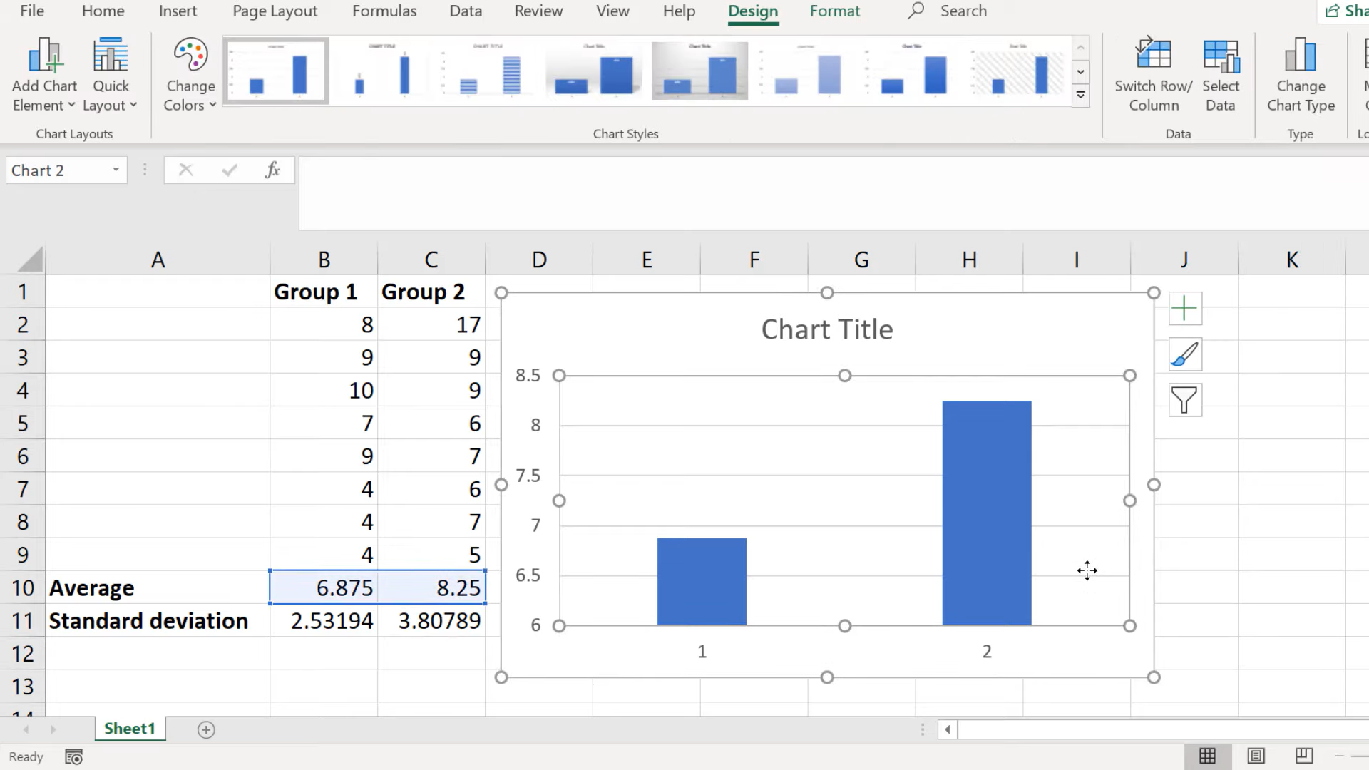
Click on the chart.
In the upper-right corner of the chart, click the Chart Elements button (a plus sign icon).
Check the Axis Titles box.
Click the axis title placeholders and enter text like "Sales" for Y-axis and "Months" for X-axis.
Select the axis titles and use the Home tab to adjust font size, style, and color as needed.
Quick answer: To add axis labels in Microsoft Excel, click the chart, select the Chart Elements plus sign icon in the upper-right corner, and check the Axis Titles box. Next, click the placeholders to enter text, then use the Home tab to adjust the font size, style, and color of your titles.
About this Microsoft tutorial
Insert and format custom axis titles in Microsoft charts by using the chart elements menu and home tab controls for clear data labeling. This guide shows how to add Axis Labels Microsoft Excel in 5 steps, starting with "Click on the chart" and finishing with "Select the axis titles and use the Home tab to adjust font size, style, and color as ne...". The interactive demo above is a click-through copy of the real Microsoft interface, so you can rehearse each step before doing it in your own account.
Frequently asked questions
How many steps does it take to add Axis Labels Microsoft Excel?
5 steps. Each one is listed in order above, and the demo highlights exactly where to click.
Can I try it without changing my own account?
Yes. Clicking through the demo doesn't touch your Microsoft data or settings. Once you know the flow, repeat it in your own workspace.
This tutorial is filed under Microsoft and Excel. Related guides: How to Add Buckets in Microsoft Planner, How to Add Dates in Microsoft Excel and How to add drop down list in microsoft excel. Last reviewed 05 Oct 2026.

Create your first interactive demo in minutes
No credit card required • Start building today