How to Make a Column Chart in Power BI
- George Apostolov
How to Make a Column Chart in Power BI: step-by-step guide
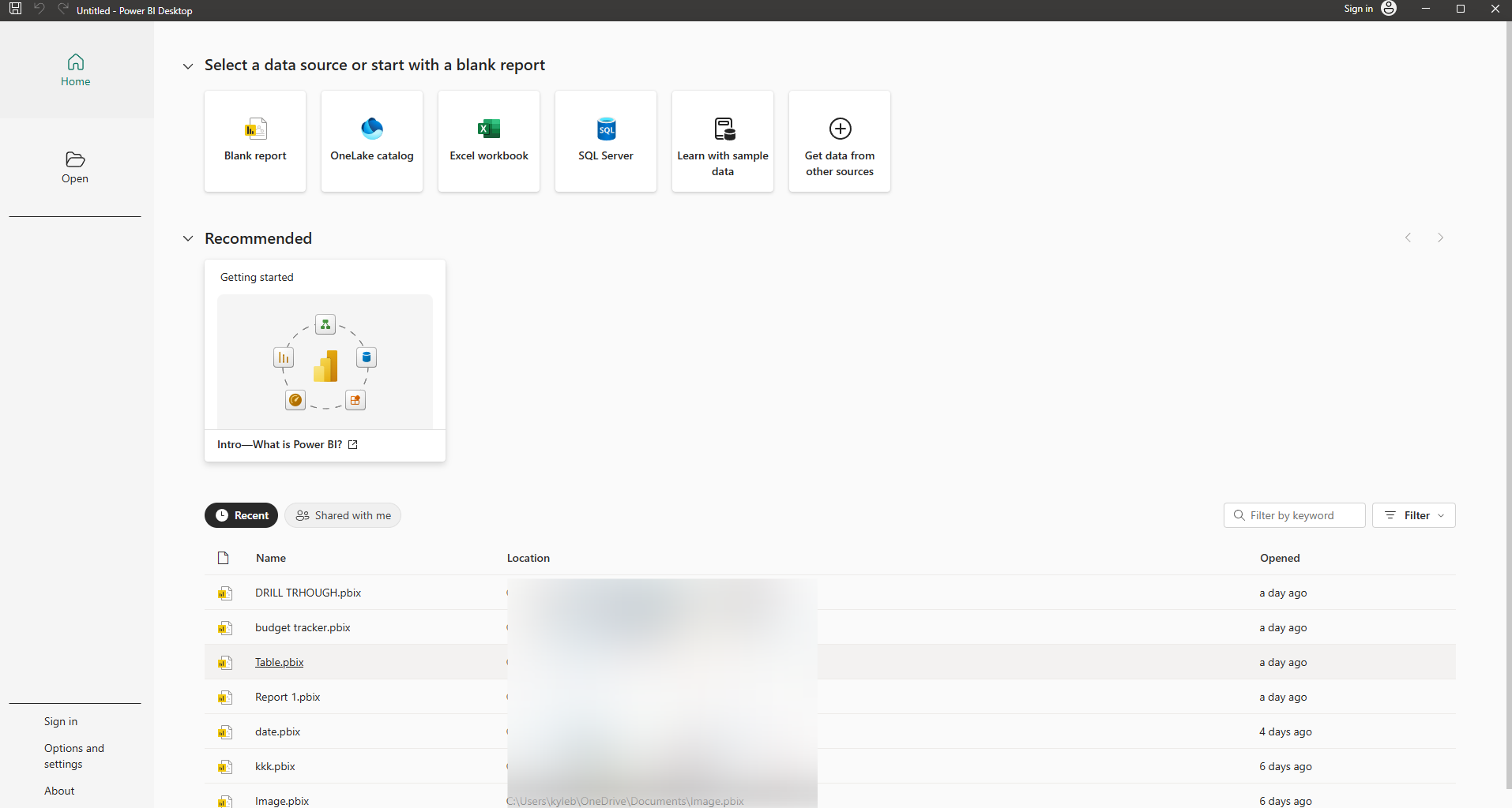
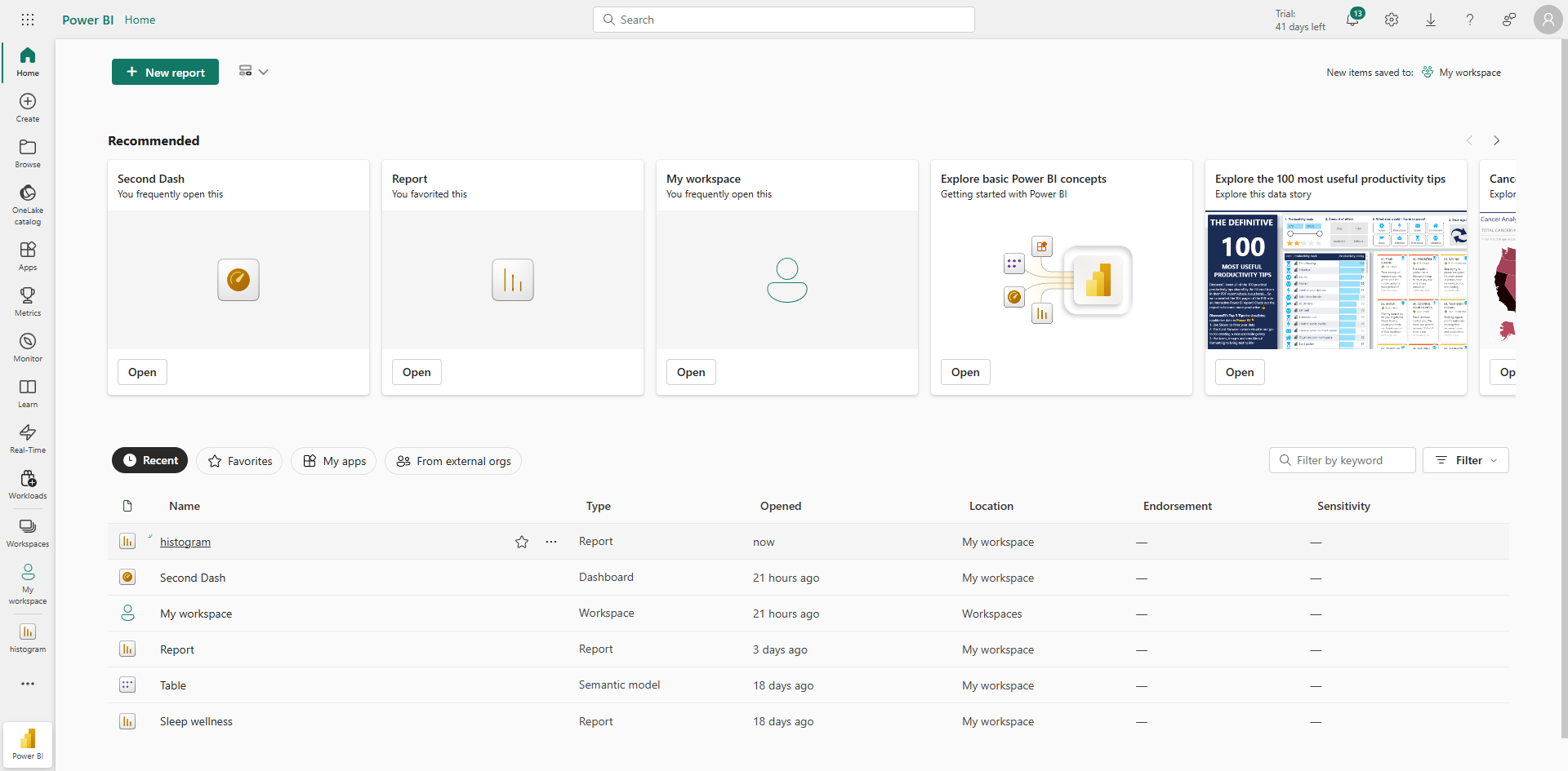
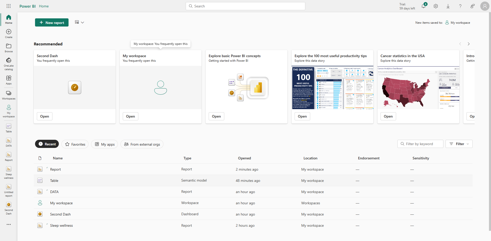
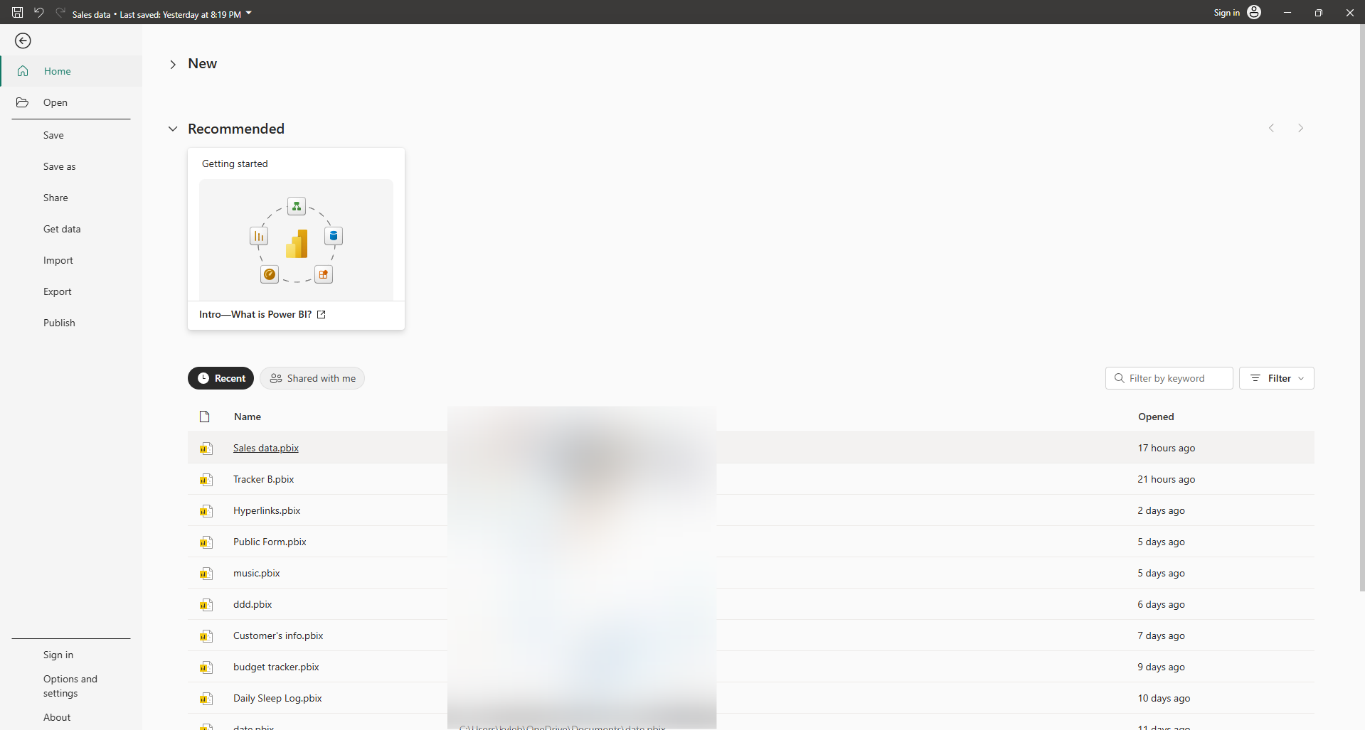
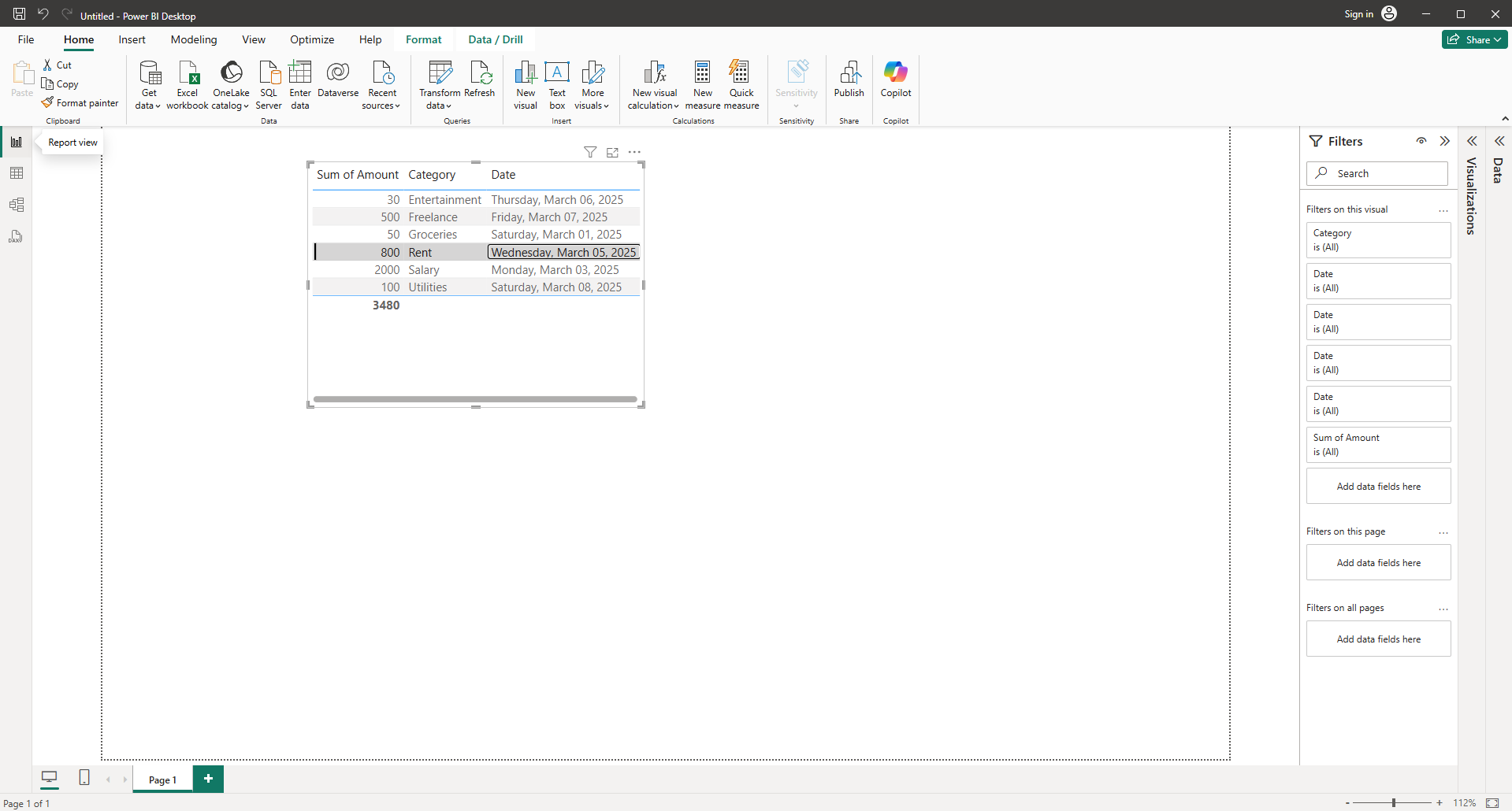
Make sure your data is already loaded or connected.
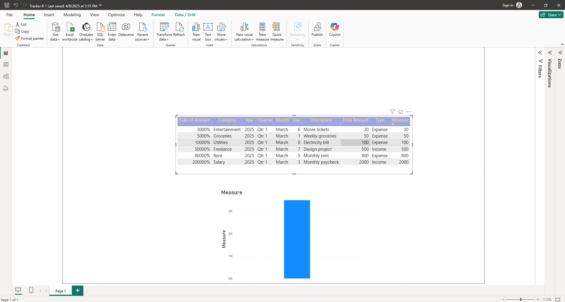
Click on the 'Visualizations' pane in your' Report' view.
In the 'Visualizations' pane, click the 'Clustered Column Chart' icon.
Following these steps can help you make a column chart in Power BI.
Quick answer: To make a column chart in Power BI, first ensure your data is loaded or connected. Next, navigate to the Report view and click the Visualizations pane. Finally, select the Clustered Column Chart icon within the Visualizations pane to generate your chart.
About this Power BI tutorial
Create a column chart in Power BI by connecting your data, opening the Report view, and selecting the clustered column chart visualization. This guide shows how to make a Column Chart in Power BI in 4 steps, starting with "Make sure your data is already loaded or connected" and finishing with "Following these steps can help you make a column chart in Power BI". The interactive demo above is a click-through copy of the real Power BI interface, so you can rehearse each step before doing it in your own account.
Frequently asked questions
How many steps does it take to make a Column Chart in Power BI?
4 steps. Each one is listed in order above, and the demo highlights exactly where to click.
Can I try it without changing my own account?
Yes. Clicking through the demo doesn't touch your Power BI data or settings. Once you know the flow, repeat it in your own workspace.
This tutorial is filed under Power BI. Related guides: How to Make a Filter in Power BI, How to Make a Histogram in Power BI and How to Make a Line Graph in Power BI. Last reviewed 05 Oct 2026.

Create your first interactive demo in minutes
No credit card required • Start building today