
Short answer: every common product demo mistake leaves a fingerprint in your analytics. A demo with no context loses viewers on steps 1 and 2. A demo that shows too much falls off a cliff after step 7. A field-by-field walkthrough shows long time on one step, then an exit. Feature tours without business impact get finishes but few leads. Jargon shows up as one audience completing while another leaves. Find the pattern, and you've found the fix.
Most "demo mistakes" articles are opinions from presenters. They're often right, but they're hard to act on, because you can't tell which mistake your demo is making. Interactive demos change that. Every viewer leaves a trail: where they started, how long they stayed, where they left, and whether they converted.
This guide maps five mistakes to the pattern each one leaves in the data, then gives you the fix and a before-and-after example. It's written by the LiveDemo team, and it uses the metrics LiveDemo tracks for every demo, but the patterns apply to any interactive demo tool with step-level analytics.
The 5 patterns at a glance
| Mistake | What shows up in the data | Fix |
|---|---|---|
| No context up front | Big drop-off on steps 1 and 2 | Open with who it's for, the outcome, and the length |
| Showing everything at once | Completion falls off a cliff after step 7 or so | Cut to 5 to 7 steps, split the rest into separate demos |
| Walking through every field | Long time on one step, followed by an exit | Zoom to the one field that matters, summarize the rest |
| Features with no business impact | Many people finish, but few become leads | Rewrite tooltips as outcomes, end with one call to action |
| Jargon | Drop-off varies by persona or traffic source | Publish a version per audience in their own words |
The metrics you need
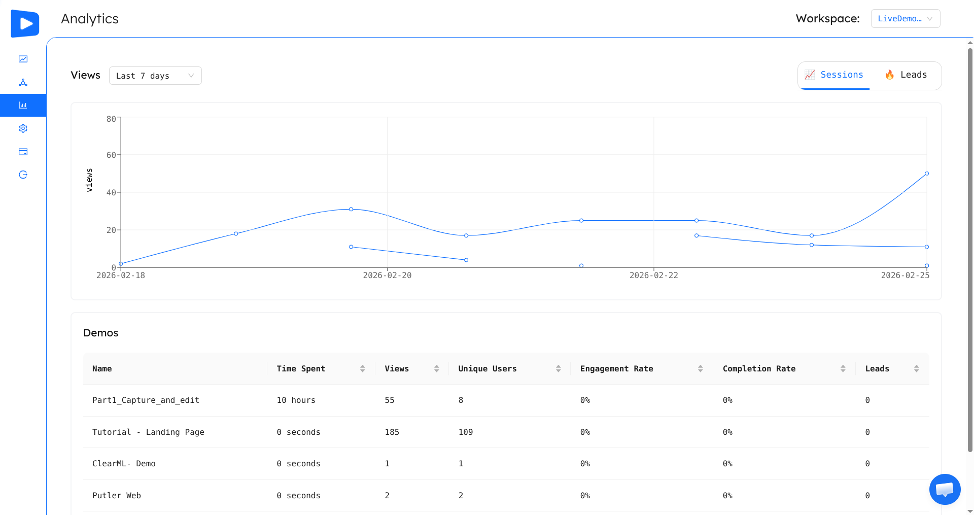
You don't need a data team for this. Six numbers are enough, and LiveDemo shows all of them on the analytics page:
- Views and unique users: how many people opened the demo.
- Engagement rate: the share of viewers who moved past the first step.
- Completion rate: the share of viewers who reached the last step.
- Drop-off point: the step where viewers leave.
- Time spent: how long viewers stay in the demo.
- Captured leads: viewers who filled in a lead capture form (lead capture is on LiveDemo Pro and up).
LiveDemo's analytics page: views over time, plus time spent, engagement, completion and leads for each demo.
One rule before you start: wait for enough data. A pattern across 10 views is noise. Look for patterns once a demo has at least 50 to 100 views from the audience you care about, and compare demos against each other rather than against an industry benchmark, because length, audience and placement change every number.
Mistake 1: No context up front
The pattern: a big drop-off on steps 1 and 2. Engagement rate is low, and the drop-off point is the first or second step.
Why it happens
A live presenter can say "I'm going to show you how a finance team closes the month in half the time" before touching the product. A self-serve demo has no presenter. If the first screen is a busy dashboard with a tooltip that says "Click here to begin," the viewer has no reason to invest a single click. They don't know who the demo is for, what they'll get, or how long it takes.
The fix
Make the first step do a presenter's job. In one or two sentences, state:
- Who it's for ("For finance teams...")
- The outcome ("...see how to close the month in half the time")
- The length ("in 6 quick steps")
Then make the first click obvious, and make it lead somewhere interesting.
Before and after
Before (step 1 tooltip): "Welcome to Acme! Click the dashboard to get started."
After (step 1 tooltip): "For finance teams: see how Acme cuts month-end close from 10 days to 5. Six steps, about a minute. Start with the reconciliation queue."
How to confirm it worked
Engagement rate should rise and the step 1 drop-off should shrink. If step 1 improves but step 2 is now the big drop, your second screen is the new problem. Check that it delivers what the intro promised.
Mistake 2: Showing everything at once
The pattern: completion falls off a cliff after step 7 or so. The drop-off chart is fairly flat for the first several steps, then viewers leave in large numbers around step 7 to 10. Time spent is high, but completion is low.
Why it happens
Teams build one demo to serve everyone, so it tries to show every feature. Viewers came for one answer. Once they have it, or once they realize the end isn't near, they leave. Anything you put after that point, including your call to action, goes unseen.
The fix
- Cut to 5 to 7 steps that lead to one "aha" moment. Our product demo builder guide covers how to choose them.
- Split the rest into separate demos by use case or persona, and link to them from the last step ("Want to see approvals next?").
- Move the call to action earlier, or make it persistent. If most viewers stop at step 6, a call to action on step 12 doesn't exist.
Before and after
Before: one 18-step "Complete product tour" covering setup, dashboards, reporting, integrations, permissions and billing.
After: a 6-step "See your first report in 60 seconds" demo on the homepage, plus three short follow-up demos for reporting, integrations and permissions, each linked from the last step.
How to confirm it worked
Completion rate on the main demo should rise sharply. Total views across the follow-up demos tell you which topics buyers care about most, which is useful for your next round of content.
Mistake 3: Walking through every field
The pattern: long time on one step, followed by an exit. Average time spent is unusually high, and the drop-off point is the same step: typically a form, a settings page or a table.
Why it happens
The demo was built by someone who knows the product deeply. They explain every field, dropdown and toggle on a complex screen, often across several tooltips on the same page. Viewers stop to read, get lost in detail that doesn't matter to them yet, and leave. Field-by-field walkthroughs belong in training material, not in a demo meant to persuade.
The fix
- Pick the one field that matters on that screen and highlight only that.
- Use zoom or pan so the viewer sees the important part at a readable size, instead of a full screen of options.
- Summarize the rest in one line ("Everything else has sensible defaults").
- Move the detail to a help-center demo for users who've already bought.
Before and after
Before (three tooltips on the same settings screen): "This is the Name field. Enter your project name." Then: "Here you can choose a region from the dropdown." Then: "Toggle notifications on or off here."
After (one tooltip, zoomed to the key control): "Pick your data region in one click. Everything else is pre-configured, so you're ready to import."
How to confirm it worked
Time spent drops toward your other demos' levels, and the drop-off point moves past the step that used to stall. If time stays high but viewers now continue, the step was confusing but valuable. Keep it, and make the tooltip shorter.
Mistake 4: Features with no business impact
The pattern: many people finish, but few become leads. Completion rate looks healthy, often among your best, but captured leads, trial signups or meetings booked from the demo are low.
Why it happens
This is the hardest mistake to spot, because the usual numbers look good. Viewers enjoy the tour and click through to the end, but they never connect what they saw to a reason to act. Every tooltip describes a feature ("This is the analytics view") and none describes a result ("See which deals will slip this quarter"). Often the last step has no clear call to action either, or it has three competing ones.
The fix
- Rewrite each tooltip as an outcome. Use the pattern action + result: "Click Forecast to see which deals are at risk this quarter."
- Add one business-impact line on the "aha" step, ideally a number the buyer cares about: hours saved, revenue at risk, tickets avoided.
- End with exactly one call to action that names the next step: "Start free and connect your CRM in 5 minutes." If you collect leads, put the form at the moment of highest interest, often just before or right after the "aha" step.
Before and after
Before (final step): "That's the tour! Thanks for watching." Buttons: "Learn more", "Contact us", "Pricing".
After (final step): "You just found $40K of at-risk pipeline in under a minute. See it with your own deals: start free, no credit card." One button: "Start free".
How to confirm it worked
Captured leads (or signups from the demo's call-to-action link) per completed view should rise. If you link the call to action to your signup page, add UTM parameters to the link so your web analytics can attribute signups to the demo.
Mistake 5: Jargon
The pattern: drop-off varies by persona or traffic source. The same demo performs well for one audience and badly for another. For example, technical visitors from your docs complete it, while visitors from a paid campaign aimed at managers leave early.
Why it happens
Demos are often written in the vocabulary of the people who built the product: acronyms, internal feature names and technical terms. Insiders read it fluently. Everyone else hits a wall. Because each audience reacts differently, the problem hides in your overall average.
The fix
To see it, you need to split your data by audience. The simplest way is to publish one copy of the demo per audience or channel, such as homepage, docs, paid campaign and sales follow-up, and compare their rows in the analytics table. Then:
- Translate features into the buyer's language. "SSO via SAML 2.0" becomes "Your team logs in with their existing company account" for a non-technical buyer.
- Use personalization to swap terms, company names or examples per audience. LiveDemo's AI text personalization can rewrite copy for a given persona, and it's included on the free plan.
- Keep the technical version for technical audiences. Jargon isn't wrong for people who speak it.
Before and after
Before (one demo for everyone): "Configure RBAC policies and propagate them via SCIM to your IdP."
After (manager version): "Decide who can see what, once. New hires get the right access automatically on day one."
After (IT version, unchanged): "Configure RBAC policies and propagate them via SCIM to your IdP."
How to confirm it worked
The gap in completion rate between your audiences should narrow. If one audience still underperforms after you've rewritten the copy, the problem may be fit rather than wording. That demo may simply be reaching the wrong people.
A 15-minute weekly demo review
You don't need a big analytics project. Once a week, open your analytics page and run through this checklist for each demo with at least 50 new views:
- Is engagement rate low? Fix the first step (mistake 1).
- Is there a cliff in the second half? Cut or split the demo (mistake 2).
- Is one step much slower than the others, followed by an exit? Simplify that step (mistake 3).
- Is completion high but leads low? Rewrite for outcomes and fix the call to action (mistake 4).
- Do copies for different audiences perform very differently? Rewrite the weak one in that audience's words (mistake 5).
Change one thing at a time, then wait for another 50 to 100 views before judging. If you change the intro, the length and the call to action at once, you won't know which change worked.
See a demo that avoids all five
This interactive demo of Putler's analytics dashboard opens on a screen full of value, stays short, and keeps a call to action visible at every step, so viewers can convert the moment they're convinced.
For more examples and what to borrow from each, see our interactive demo examples. For general demo advice that goes beyond analytics, read 7 product demo mistakes that kill conversions.
Frequently asked questions
How do I know if my interactive demo is working?
Look at three numbers together: engagement rate (the share of viewers who move past the first step), completion rate (the share who reach the last step), and leads or signups per completed view. A demo is working when viewers get past step 1, most of them finish, and finishers take the next step.
What is a good completion rate for an interactive demo?
It depends on length and audience, so compare your demos against each other rather than against an industry number. As a rule of thumb we use internally, short demos of 5 to 7 steps that complete less than half the time usually have a fixable problem in their first two steps or their length.
Why do viewers drop off on the first step of a demo?
Usually because the first screen gives no context. Viewers do not know who the demo is for, what problem it solves, or how long it will take, so they leave before clicking. Adding a one-sentence intro that states the audience, the outcome and the length is the most common fix.
Why do people finish my demo but not sign up?
Because the demo showed features without connecting them to an outcome the viewer cares about, or because the last step has no clear call to action. Rewrite tooltips to state the result of each click, and end with a single call to action that names the next step.
What demo analytics does LiveDemo track?
LiveDemo tracks views, unique users, time spent, engagement rate, completion rate, the step where viewers drop off, and captured leads, for every demo in your workspace.
Start measuring your demos
If your demos don't have step-level analytics yet, you're guessing. Build your first demo with LiveDemo, start free, and publish it where your buyers already are. Then let the data tell you which of these five mistakes to fix first.